Red, yellow, blue, green the primary colour building blocks for all the letter colours and a purist colour way iconic in vintage duplo and simple kids toys of the 70s and 80s.
Also known in artworks by the bauhaus movement.


I am a huge fan of this basic style for its playful, childlike aesthetic.

Whether it be in clothing or interior products, this colour palette works well in any kinds of shapes and patterns, but especially in geometric shapes and stripes, accentuating the child like look.

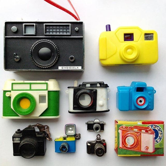
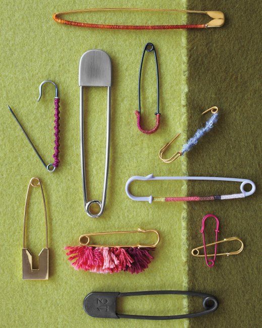
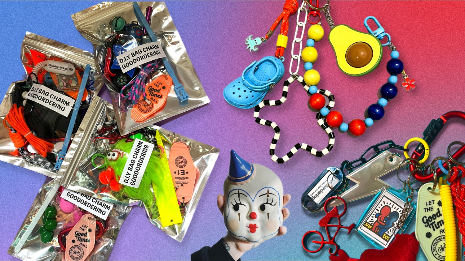
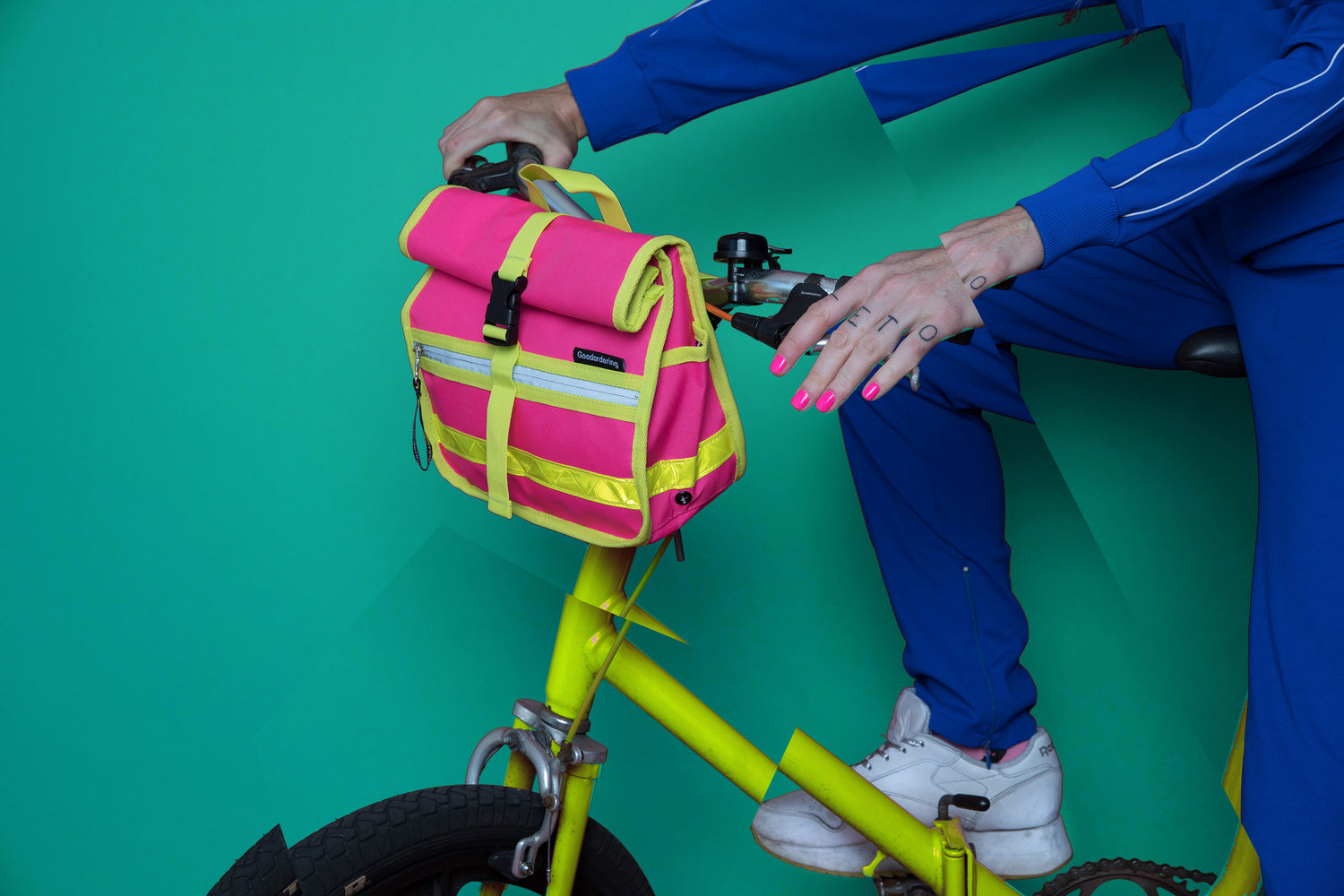
The mood board below shows off the application of these colours.

Using these bright primary colours in electronics and home appliances adds a huge amount of playfulness to these ‘adult items’ making them seem much for accessible to users of all ages.

Using paint to add blocks of colours to your home or workplace can bring an instant feeling of restfulness and fun to any walls. Proportions are important here as the colours need to work together in harmony.
if you think that this colour combination is only applicable to children’s toys and clothes then have a look at some of the images within this blog post for inspiration.

Combining these essential colours together produce a dopamine hit of a highly recognisable combination.

Even some very well known logos use a combination of these primary colours. Most indicate brands that are affordable and accessible to all, in keeping with their immediately recognisable heritage.


Babies see colours that are highly contrasting first after black and white.
The Clowncore aesthetic is a look known for its use of primary block colours perhaps for its recognition to kids and babies.

I have also designed a bauhaus style print for our bathroom using geometric shapes and an abstract image of our family you can order your own, personalised to your family on my etsy site here


